
UX takes aim at the Hawaii missile crisis.
By Max Morein
Background
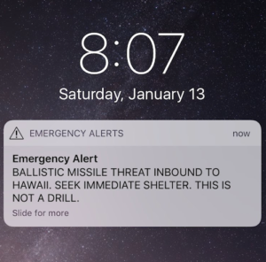
On January 13, 2018 an alert was sent via television, radio, and mobile devices informing people in Hawaii about an incoming ballistic missile. For those who received the alert, panic ensued. Thirty-eight minutes later, a notification was sent stating the original message was an error.
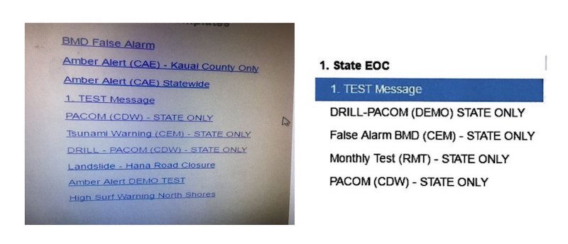
Images began to appear on social media purporting to show the interface (see image below) from which the erroneous alert was sent. The images gave a glimpse of an interface that was poorly designed with various alert options being nearly indistinguishable from one another. It was a system that showed no sign of embracing usability best practices
A state investigation later found “insufficient management controls, poor computer software design, and human factors” contributed to the false alarm. They also reported that the individual who initiated the alert did indeed believe the alert to be valid at the time it was sent.
While UX optimizations alone may not have entirely prevented this situation, we can imagine that they would serve to enhance the usability of the system and decrease the likelihood of future errors.
What we do and don’t know
Prior to embarking on our design process it’s important to understand the problem we are solving. In this case, because of the sensitive nature of the interface, a fully informed understanding of how the system works is not possible. With the images released by the Honolulu Civil Beat, we can assume that we have, at least, a partial view at what the interface looks like, or at least the various alert types that can be sent.
Our process
At C-K, our design process is defined by a user-centered approach. In this case, because of our inability to get in front of real users of this system, we had to be inventive in our methods to validate design decisions. We conducted a group critique and gathered informal feedback from colleagues to, at least preliminary, validate some design decisions.
Our typical design process follows these steps:
- Identify requirements
- Identify stakeholders/ audience
- Identify goals of redesign
- Conduct additional research as needed
- Create designs iteratively
- Test and learn with real users
- Inform design decisions
As part of our iterative process we came up with many possible solutions and decided to move forward by defining three through wireframes. Each is characterized by a unique set of design decisions and has its own benefits and drawbacks.
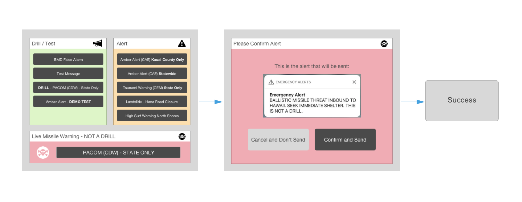
- Shows all possible alert options in one view while grouping alerts into three categories to make an easy distinction among the alert types, given the wide differences in their purpose.
- The groups are distinguished from one another in three ways: By introducing color, by introducing icons and through layout considerations.
- Importantly, once an alert has been selected there is a confirmation step where the issuing user sees a preview of the alert they are about to send. They have the opportunity to ‘Cancel and don’t send,’ or ‘Send.’
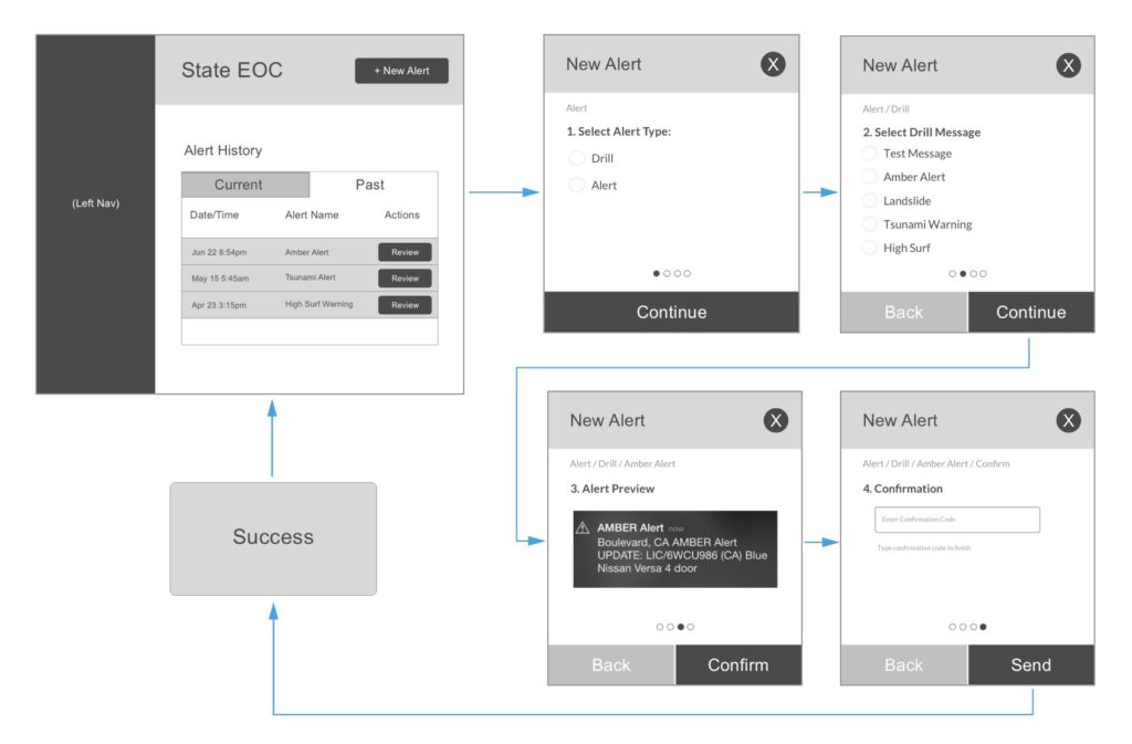
- Begins with the user on an alert history page. Here they are able to see all alerts that have been issued both past and present. This aims to cut-down on any duplicate efforts as this could also lead to an erroneous alert being sent.
- Once the user clicks ‘New Alert’ they are brought through a series of steps where they select the alert type, alert message, and see a preview of the alert.
- The final step is to input a password, with the goal of requiring involvement of a manager to be able to send an alert.
- Once the alert has been sent, the user is brought back to the alert history page where they can now retract or otherwise modify the alert.
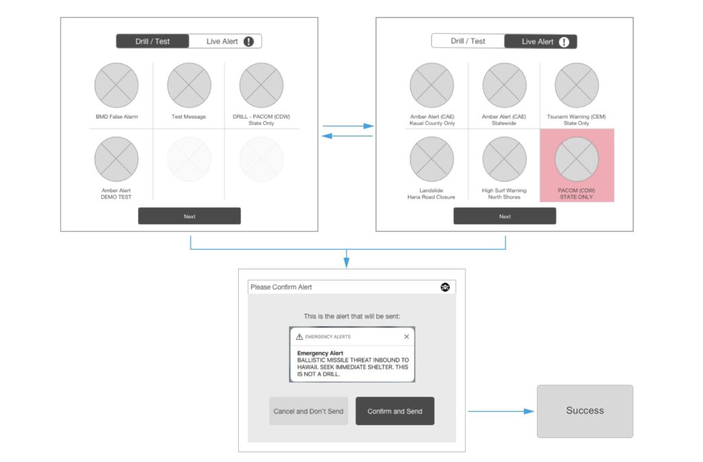
- The user begins on the drill/test pane. Because of the innocuous nature of those alerts, it makes the most sense to begin on the screen that poses the least risk.
- The user is able to toggle between ‘Drills’ and ‘Live Alerts’ views.
- The live missile alert has the additional affordance of a color shade to differentiate it from the other live alerts, given the importance of its potential use, and the ramifications of its misuse.
- Finally, the user is brought to a confirmation step where they see a preview of the alert they are about to send and can decide send or go back and cancel.
How this applies to our work with clients
At C-K this is the same iterative design process we explore for our clients and their needs. Rather than jumping to the solution, in our process it’s important to seek to solve design problems by coming up with many ideas in an iterative fashion. At that point, we are able to determine what is working well or what could be improved for each concept, with those factors then contributing to an overall smarter design solution.
Article Sources:
Hawaii Panics After Alert About Incoming Missile Is Sent in Error
Hawaii emergency worker behind false missile alert said he thought the state was really under attack
Twitter – @Tulsi Gabbard (Hawaiian Congresswoman)
More Insights
- January 29, 2018 Welcome to our podcast, the 4CKast.
- January 17, 2018 Voice Search: How to optimize your brand’s presence.
- January 15, 2018 News Feed changes coming to Facebook.